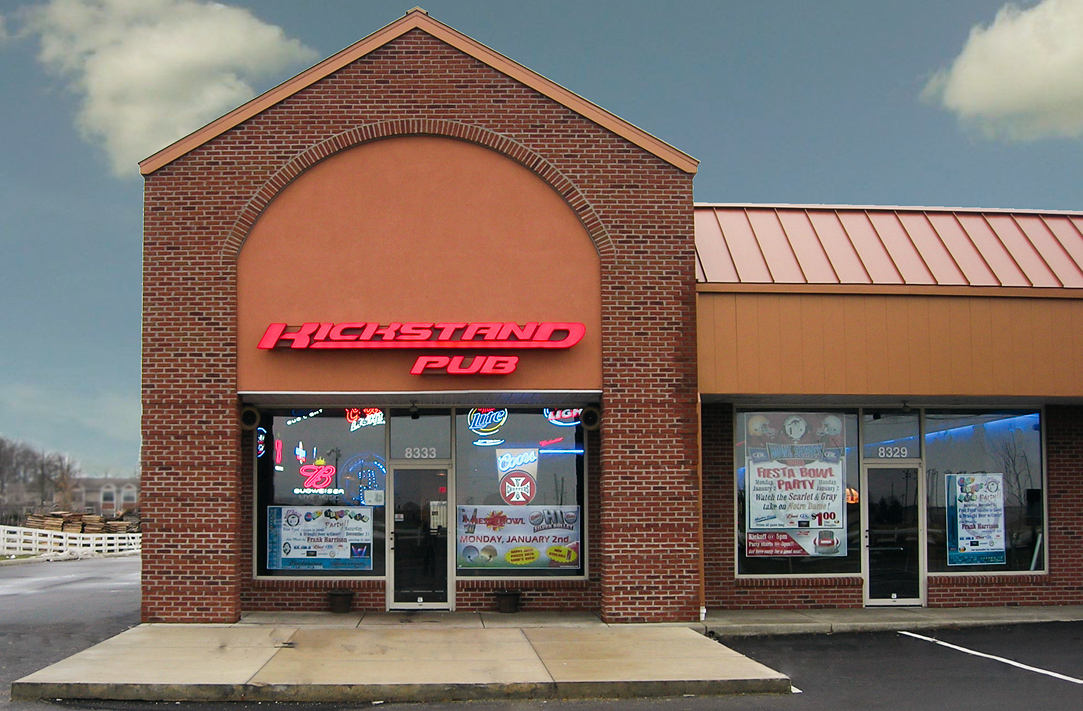
The Kickstand Pub.

How designing for a new “Bad-Ass” brand set the tone for building customer engagement and riding in style for all.
About the Client
Everything we designed was driven by the motto that, “If it’s not bad-ass, we don’t want it!”, a mindset that significantly clarified branding and design goals. That vision provided everyone involved something to aspire to, and effectively create the richest of designs.
The Challenge
The immediate challenge we faced was how to create a design system that was going resonate with their audience and build engagement. We also need to problem-solve for what to do with the stage wall. Our initial thought was to spray paint the logo onto it, but we quickly realized there was an opportunity to do something truly memorable.
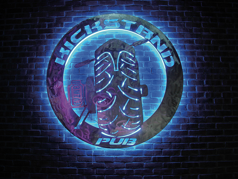
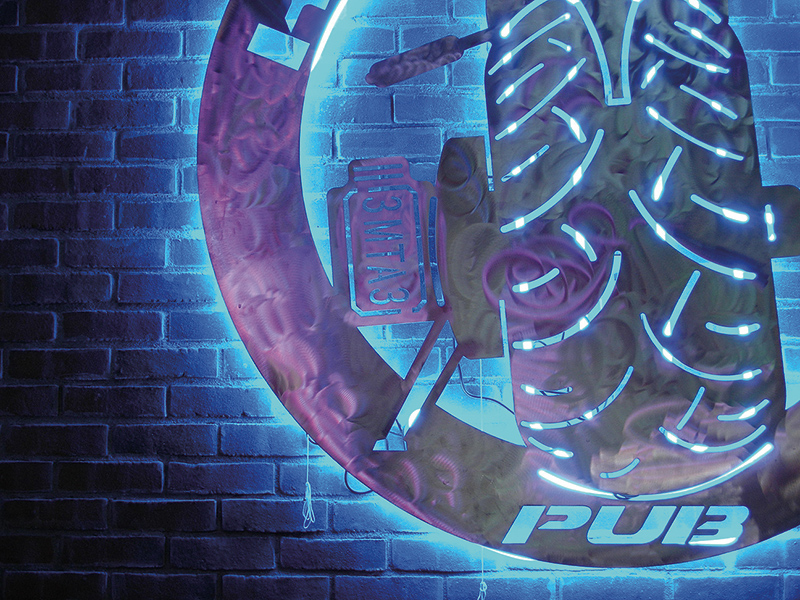
The interior sign created in stainless steel, mounted on the music stage’s red brick wall, and backlit with blue neon was absolutely stunning to look at when bands played!
Dimensions: 4′ x 4′ x .25″ stainless steel, laser cut, buffed, with additional stainless mounts for neon and final mounting.
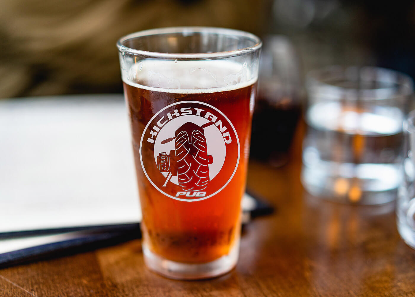
The Kickstand Pub’s primary customers are Harley-Davidson motorcycle enthusiasts, and attracted crowds with vintage, custom, and stock riders for Bike Nights. Offering mostly domestics and a few craft beers from regional breweries along with their famous “Dual Exhaust Shot Nights.”
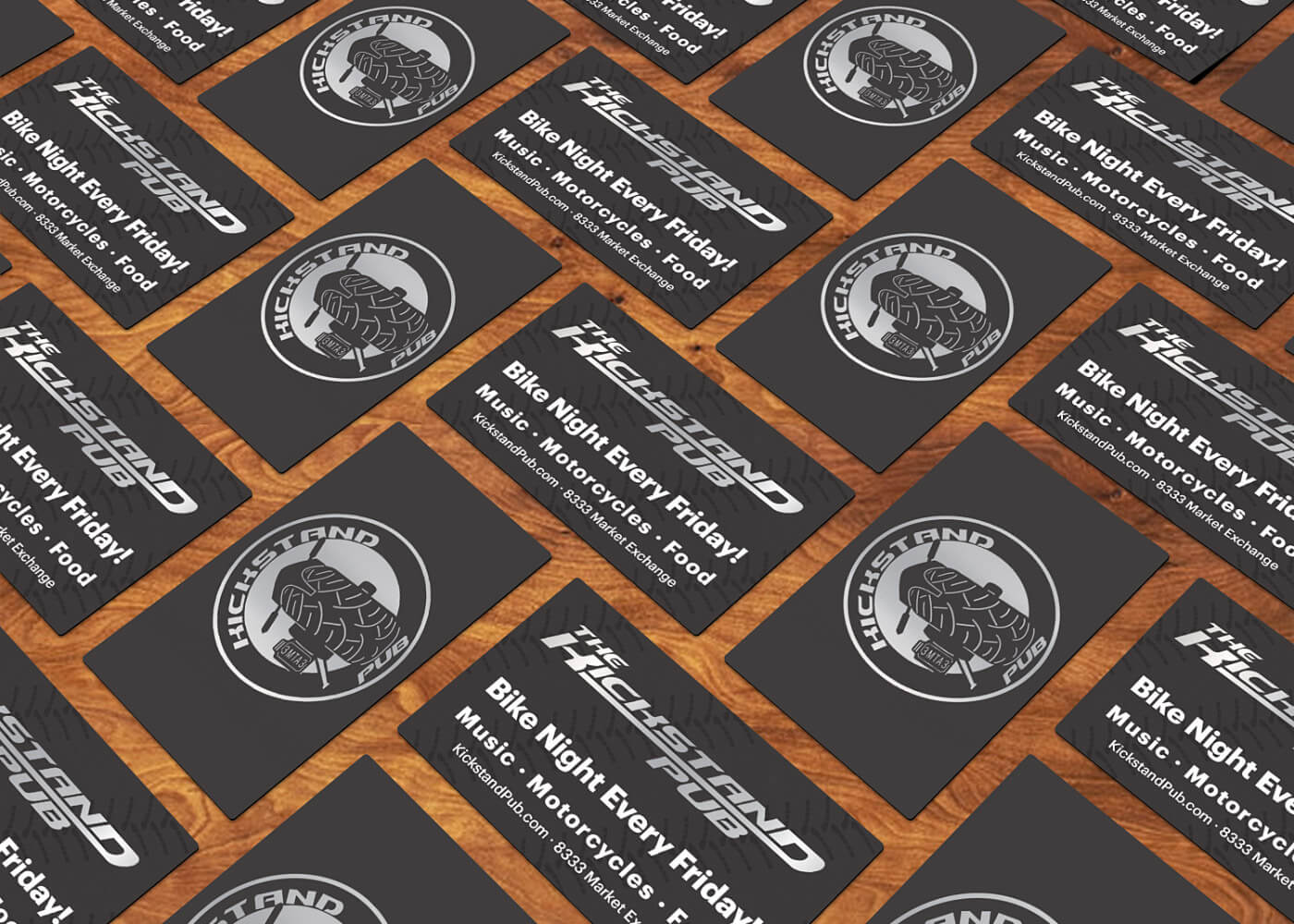
Their biggest attractions featured live music from local bands and food trucks on college football game days, making them a fantastic place to hang out.
The effect that our branding and visual identity design efforts had on their business.
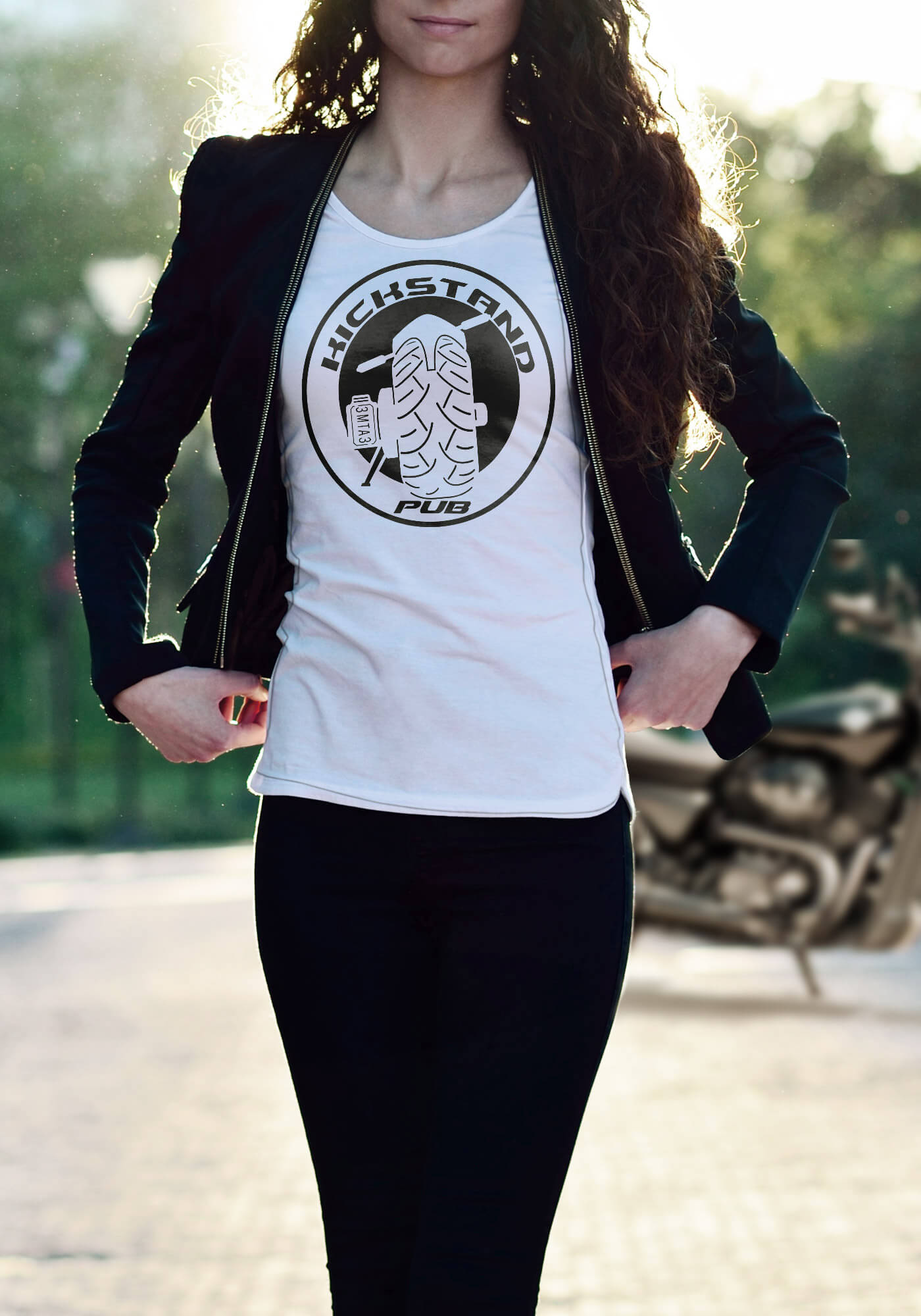
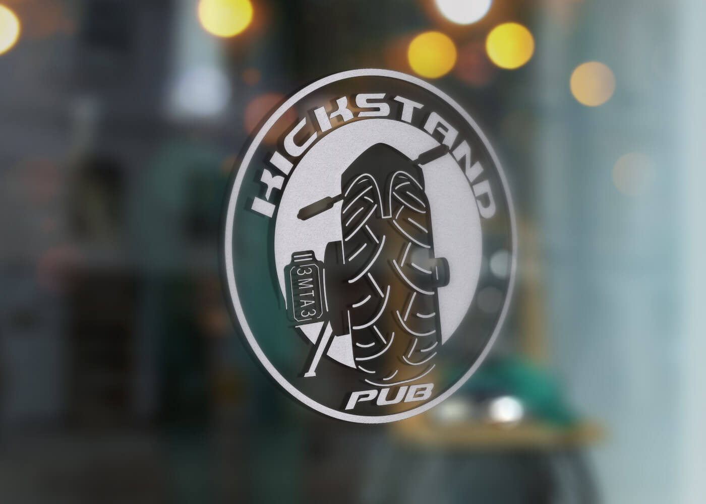
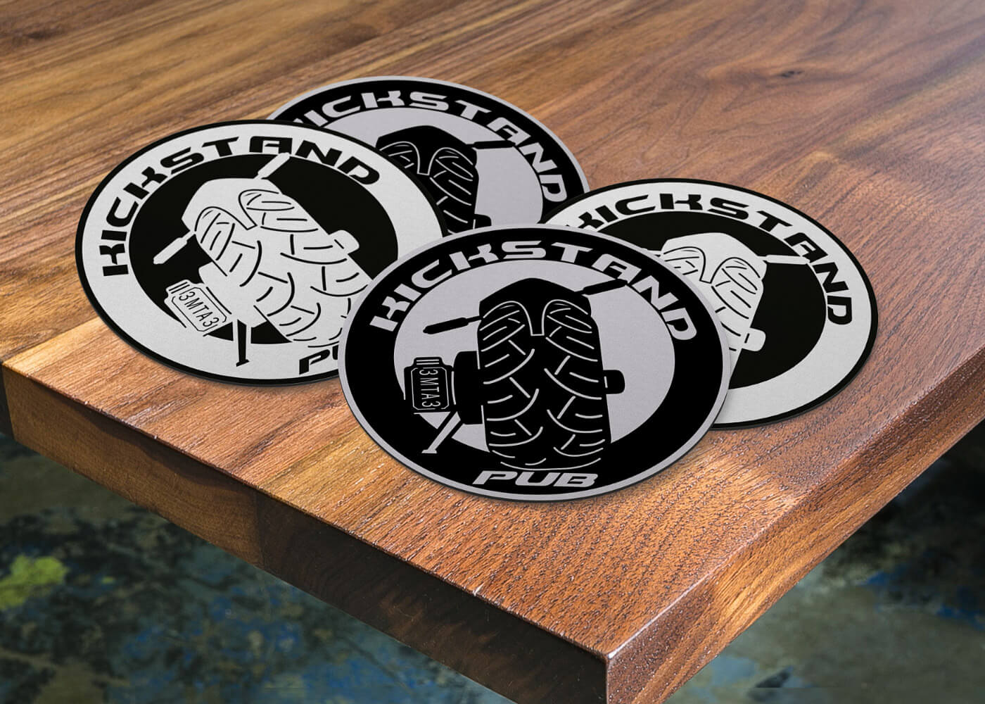
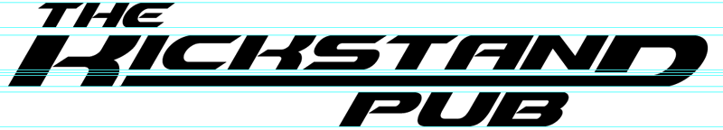
Our approach was to design a 2-phase identity system, where the round moniker is the primary brand design and used like a stamp, while the slanted logotype was to be used for signage, band posters, and the more formal representation for the establishment.
We created a lot of different types of printed collateral that supported the the bar, but the best thing was hearing how people loved all of the work we did.
The highly customized Harley-Davidson image that you see above serves as our constant source of inspiration.