Digital Amplification.
About the Client
Digital Amplification is a disruptive marketing amplifier by cutting through the noise so brands can connect with those who matter most.
Digital Amplification is a full service integrated advertising agency focused on digital marketing solutions. They have extensive experience in the world of performance and awareness media channels, digital marketing, integrated media, analytics, market intelligence, and insight-fueled creative.
The Challenge
We worked with Digital Amplification on a variety of significant projects that included designing a new logo, their brand identity, user experience and website design, along with several other marketing pieces.
We constantly challenged ourselves to push the limits of color, typography, imagery, layouts, and interactivity so that everything we designed would honestly reflect the energy behind their brand.
Logo Design
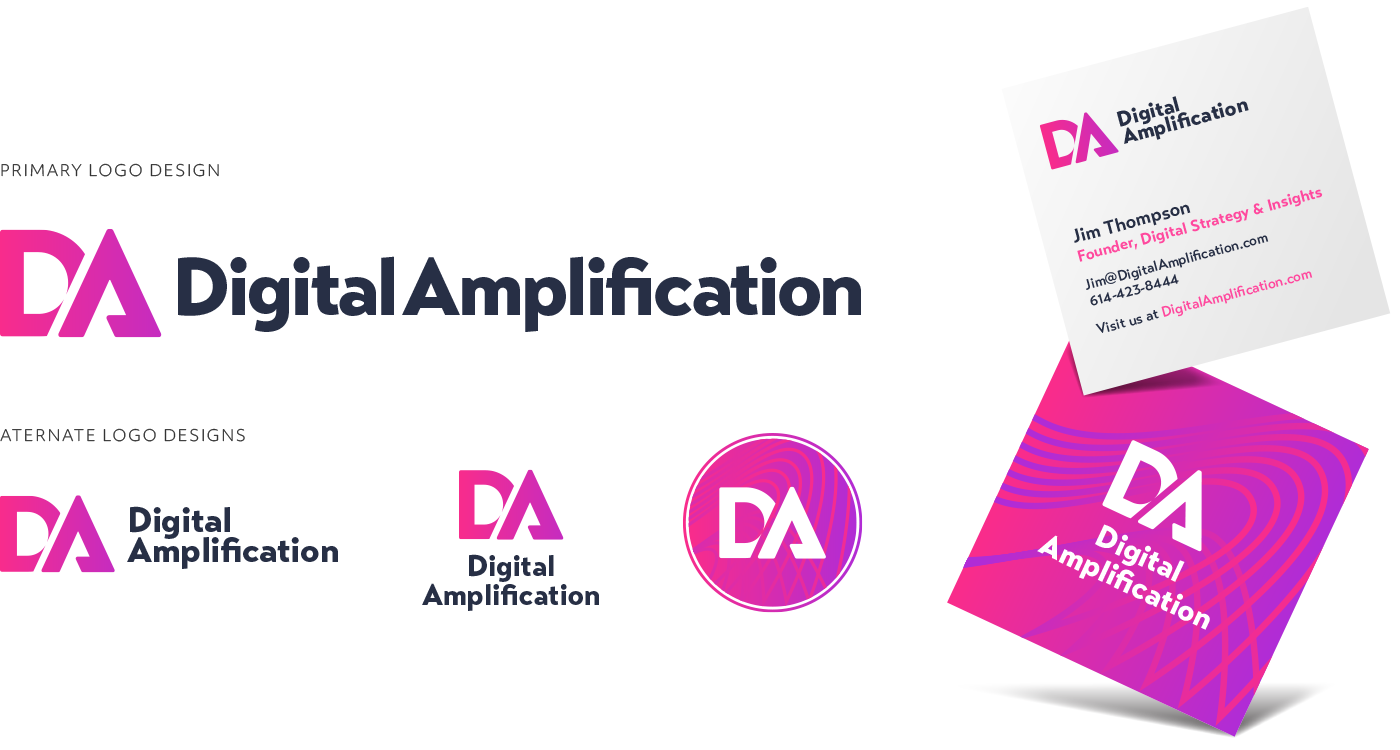
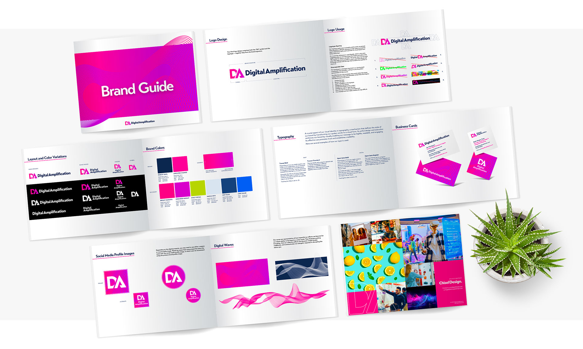
We started the logo design project with some rough ideas for both the symbols and logotypes, and then refined them into viable concepts for consideration (grayscale logo’s). One concept they really liked was the font we presented, and asked us to apply it to several of the other designs.
One insight from our conversation centered on the idea of integrating a Delta ( Δ ) into the symbol design, which represents change — something that reflects producing a positive change for their clients.
An interesting takeaway we had from our design discussions was that they really liked the “Wave” graphic. In the design presentation, it became clear that it was a bit too nuanced to be used as a logo symbol, so we decided to refined it, and integrated it into the visual identity. That effort further reinforces amplification and creating a path for positive change.


User Experience &
Website Design
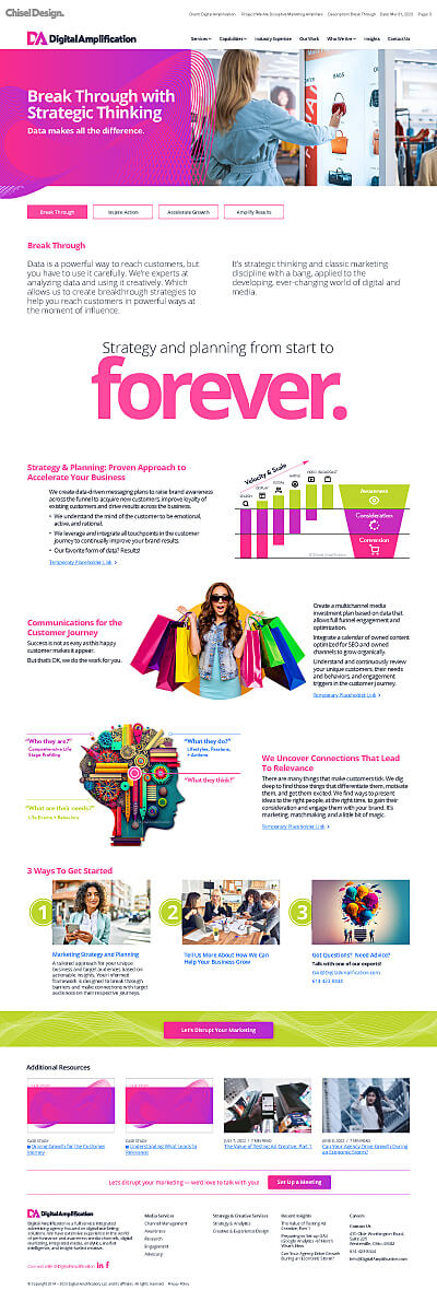
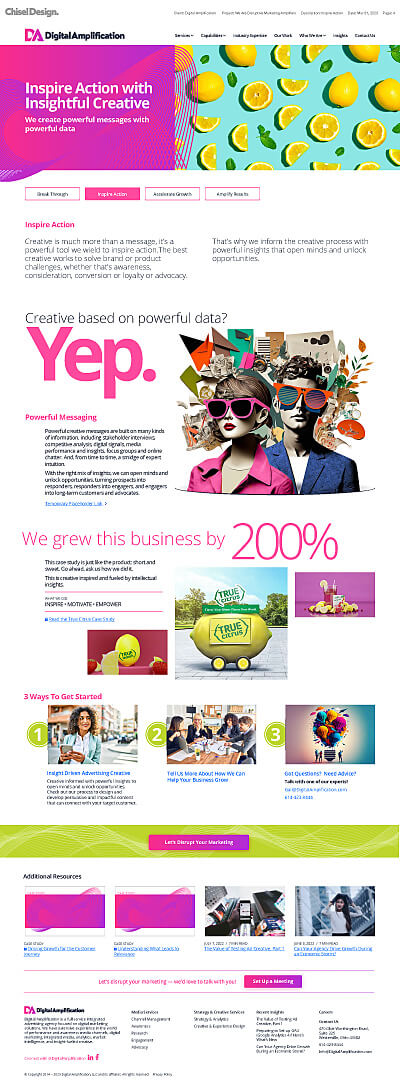
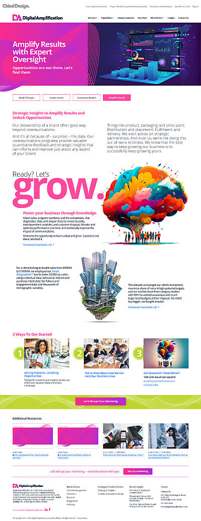
To immerse users in the experience and convey the essence of working with the DA team, the website’s visual design used a generous blend of imaginative and vibrant imagery, along with extremely large titles. The design goal we had in mind was to captivate the audience and offer a glimpse into the possibilities of collaborating with the team.
We designed the content with a mixture of layouts, making each page feel distinctive by breaking free from convention, and presenting their content in a creative fashion. We utilized a combination of traditional and generative-style imagery, resulting in visually stunning and impact-driven designs. We also used extremely large and vibrant titles to communicate a singular, all important point.
The content was also crafted to convey flexibility working with the team and emphasize various options clients have. It was important to express that there’s not a rigid, one-size-fits-all with their approach. They’re adaptability and responsiveness is what gives them a competitive advantage when it comes to their clients business goals.
The imagery we used simply radiates creativity and confidence, and perfectly aligns with their brand identity. It instills a sense of assurance with current and potential clients that their decision to work with the team will be managed with strategic insight and careful attention to detail.
Website Visual Designs
Newsletter Design
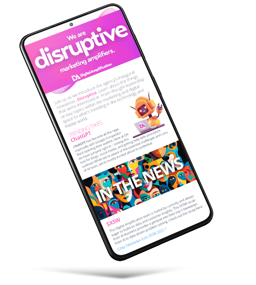
As part of the overall rebranding efforts, we also undertook the redesign of their newsletter. We continued with elements breaking their graphic frame and maintained the same funky graphic style we had been leveraging on the website.
The goal was to continue with stand-out imagery, vibrant colors, and visually engaging typography.
What our branding and visual identity design built for their business.
We helped Digital Amplification become more focused on communicating the type of disruptive work they perform to those that matters most.
We helped them refine their brand image into something that authentically echos who they are through with a variety of design methods. Vibrant color, highly engaging imagery, and interesting typography and page layouts all served in telling a unique story about how this digital marketing agency is able to make a profound impact on the businesses they serve.
It’s the character and quality of the people behind the brand — their marketing experience, strategic thinking, and keen insight is what sets them apart — we simply translated that into a platform that helps others see those qualities as well.
“They’re entirely courageous how they wanted the graphics to appear. It was an over-the-top, cross-the-line, and make-it-louder approach that helped drive everyones efforts. They gave us freedom to explore the ridiculous and push the limits, and we took advantage of that, producing a visual identity that exudes energy, spirit, and real verve.”

