Schell Cabinetry + Design.
About the Client
Schell Cabinetry + Design came to us in need of help getting ready to launch their new business. They had already developed the name and had a good idea about the kind of style they were looking for in the logo, but looked to us to deliver an identity they and their customers would love.
The Challenge
The challenge we faced was crafting a logo that felt authentic to our client. We created a number of rough concepts involving a logo symbol, but they fell short when we evaluated them with the client in context of the brand direction. Changing course, we identified attributes about their brand that we felt would provide a better outcome.
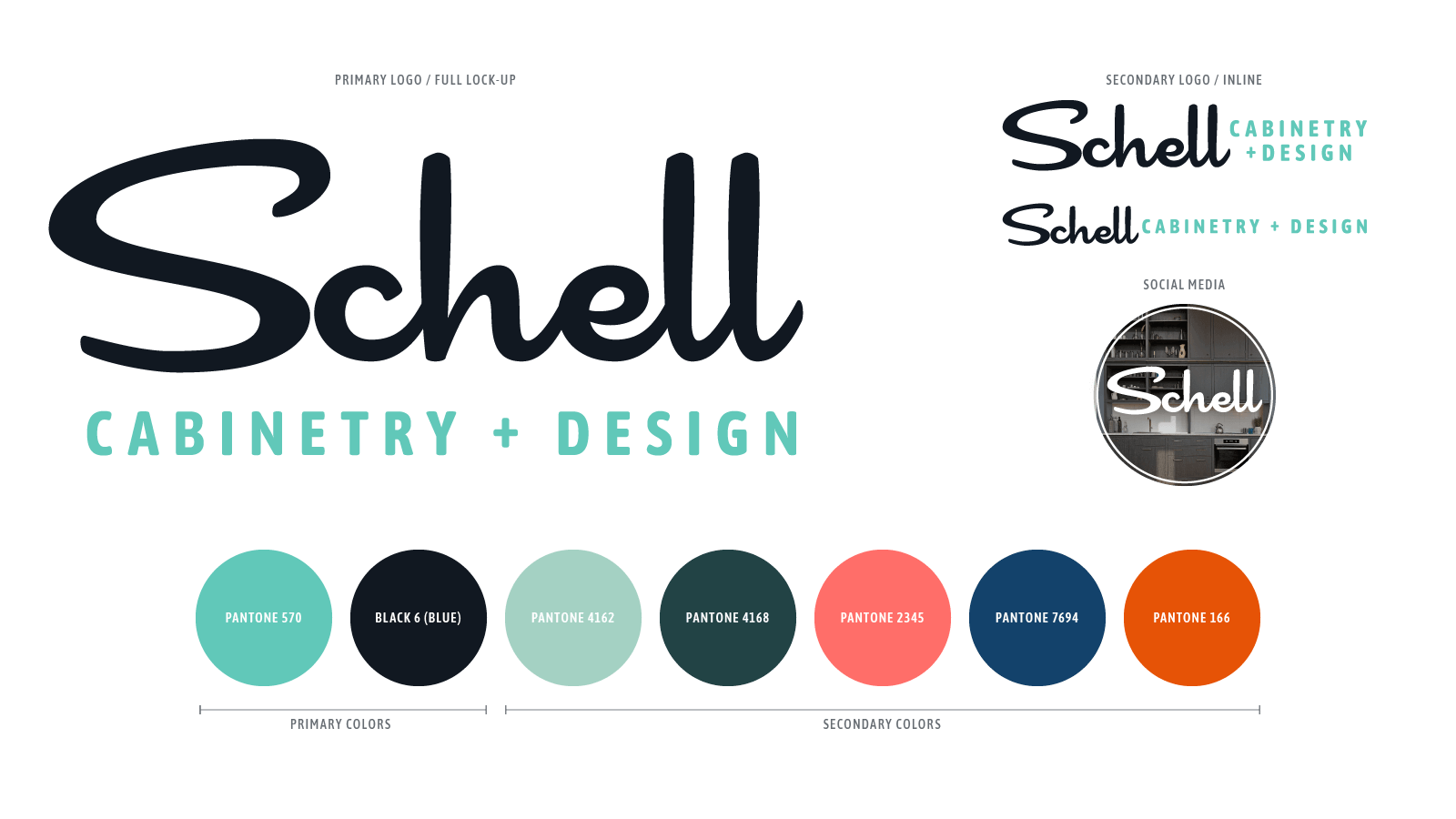
Logo Design Concepts and Final Color Palette.
After going through several rough ideas with the client, we landed on a signature-type style for two reasons. First, they wanted their logo to feel like personal, as though they actually signed their work. Second, they wanted it to feel fun and retro.
With this in mind, we agreed that having any type of enclosure around the logotype would detract from the signature itself feeling iconic. The color palette echoed those sentiments by taking on a mixture of retro-meets-modern feel in the form of more vibrant and saturated colors. Our goal was to use the palette on the website and other digital properties, but also for in-store colors, fixtures, and textures.
Color became such an important conversation for this brand because of the in-store customer experience they wanted people to encounter.
Schell selected the second logo design presented here, and we built that design into a flexible system allowing for inline and social applications.
Brand Identity.
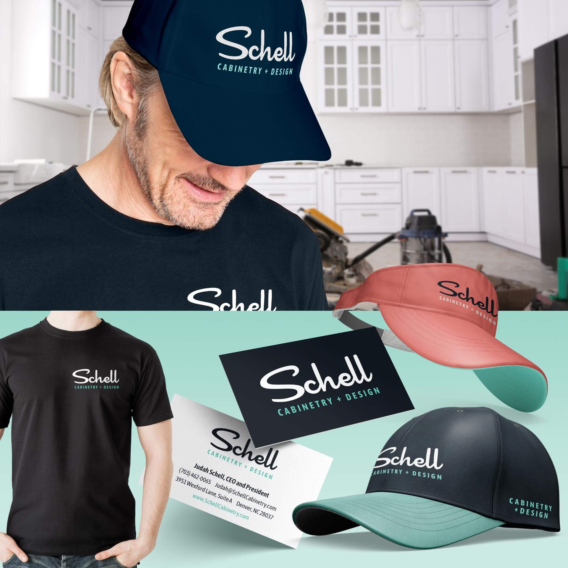
Once we finished the logotype layouts and color palette, we designed the assets they needed straight away, like apparel and business cards. We also provided guidance with the best applications for t-shirts and embroidery for apparel. Logo’s on apparel need to take a lot of abuse so that they continue to look good after a lot of wear and tear, especially since Schell’s logo’s are used in a woodworking and installation environment.
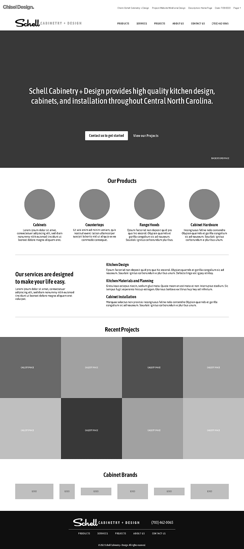
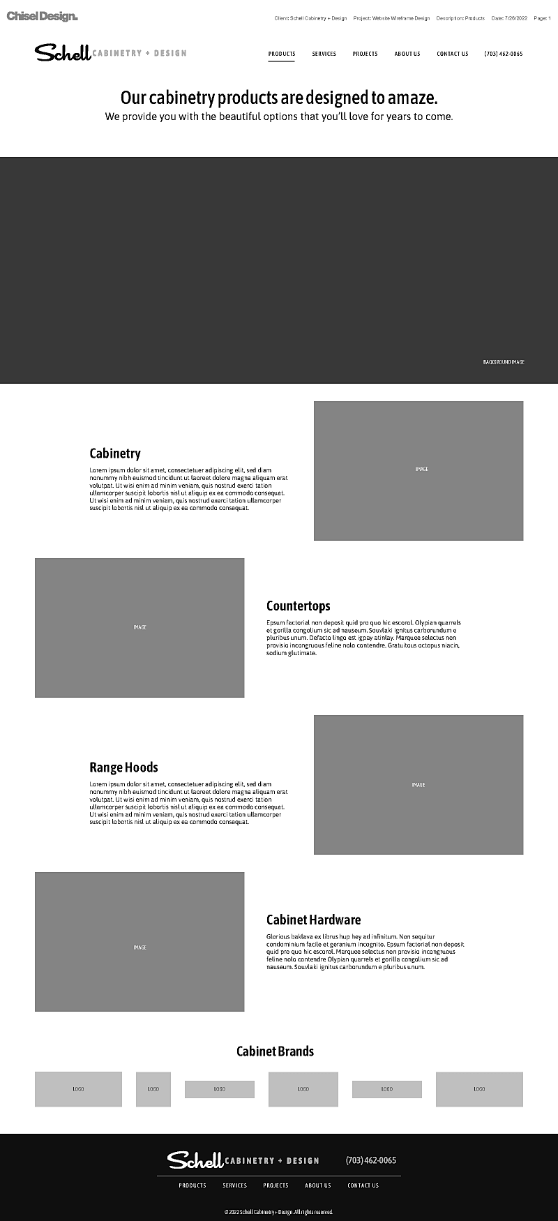
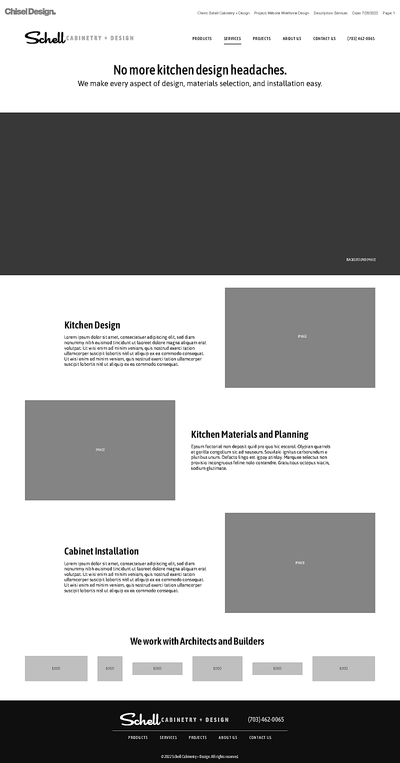
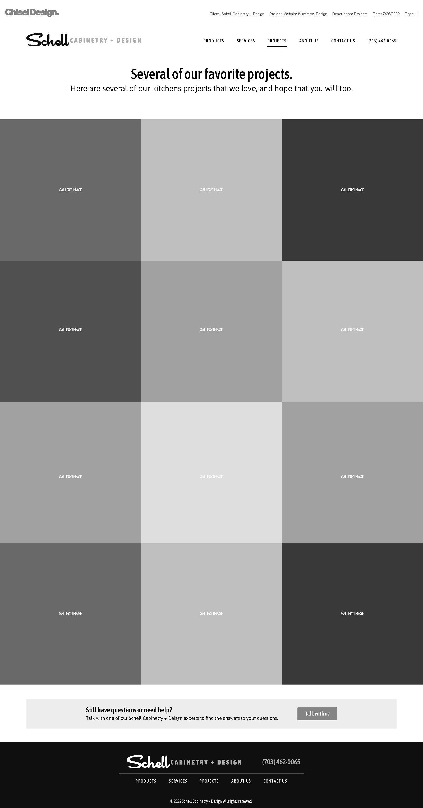
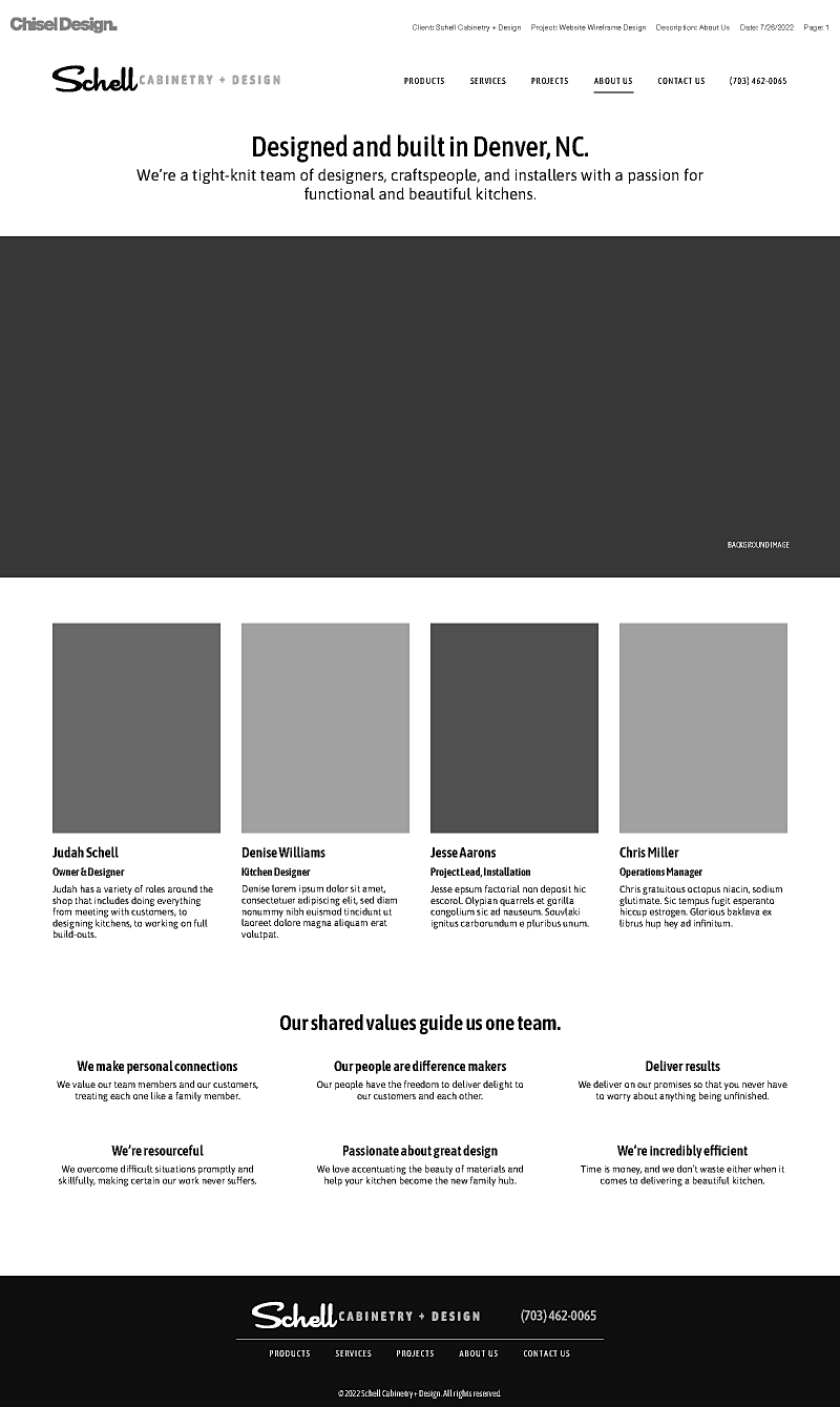
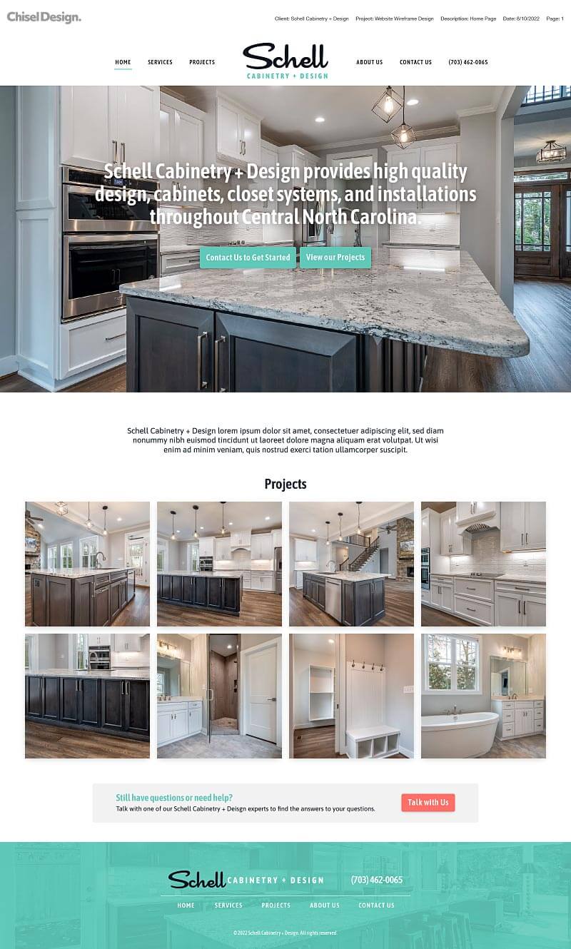
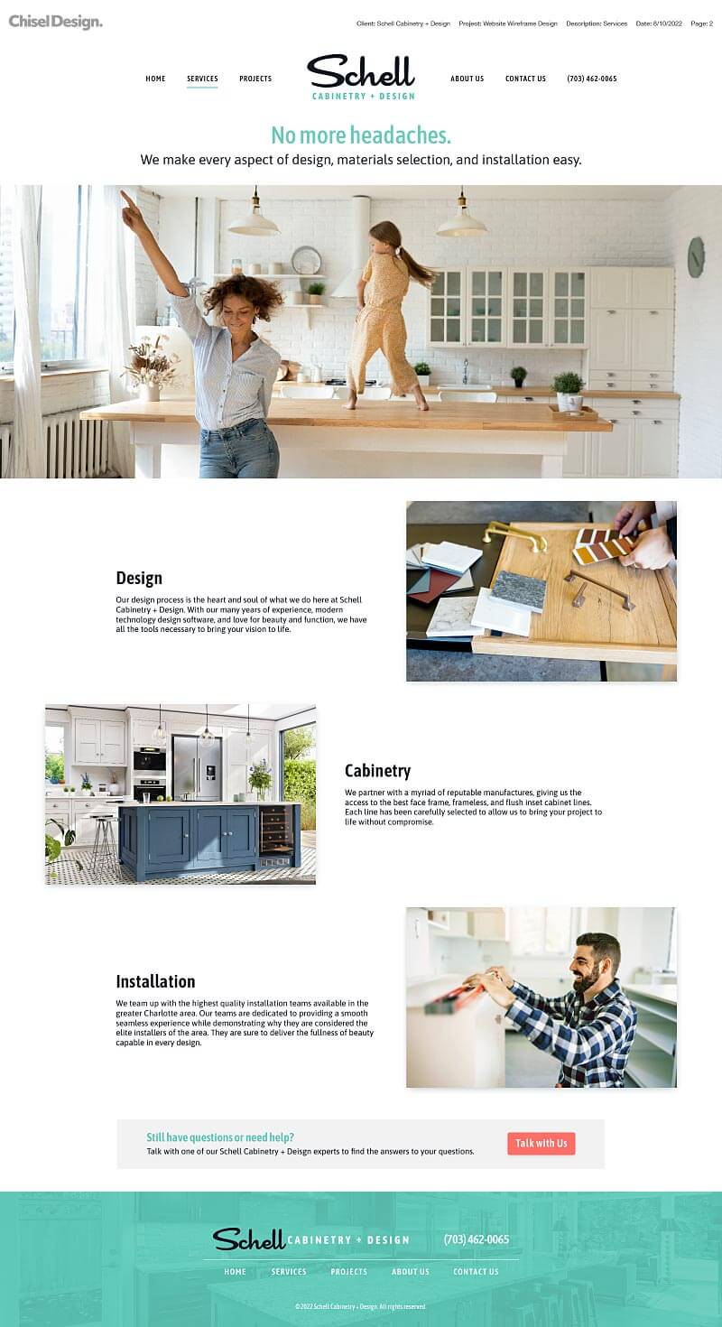
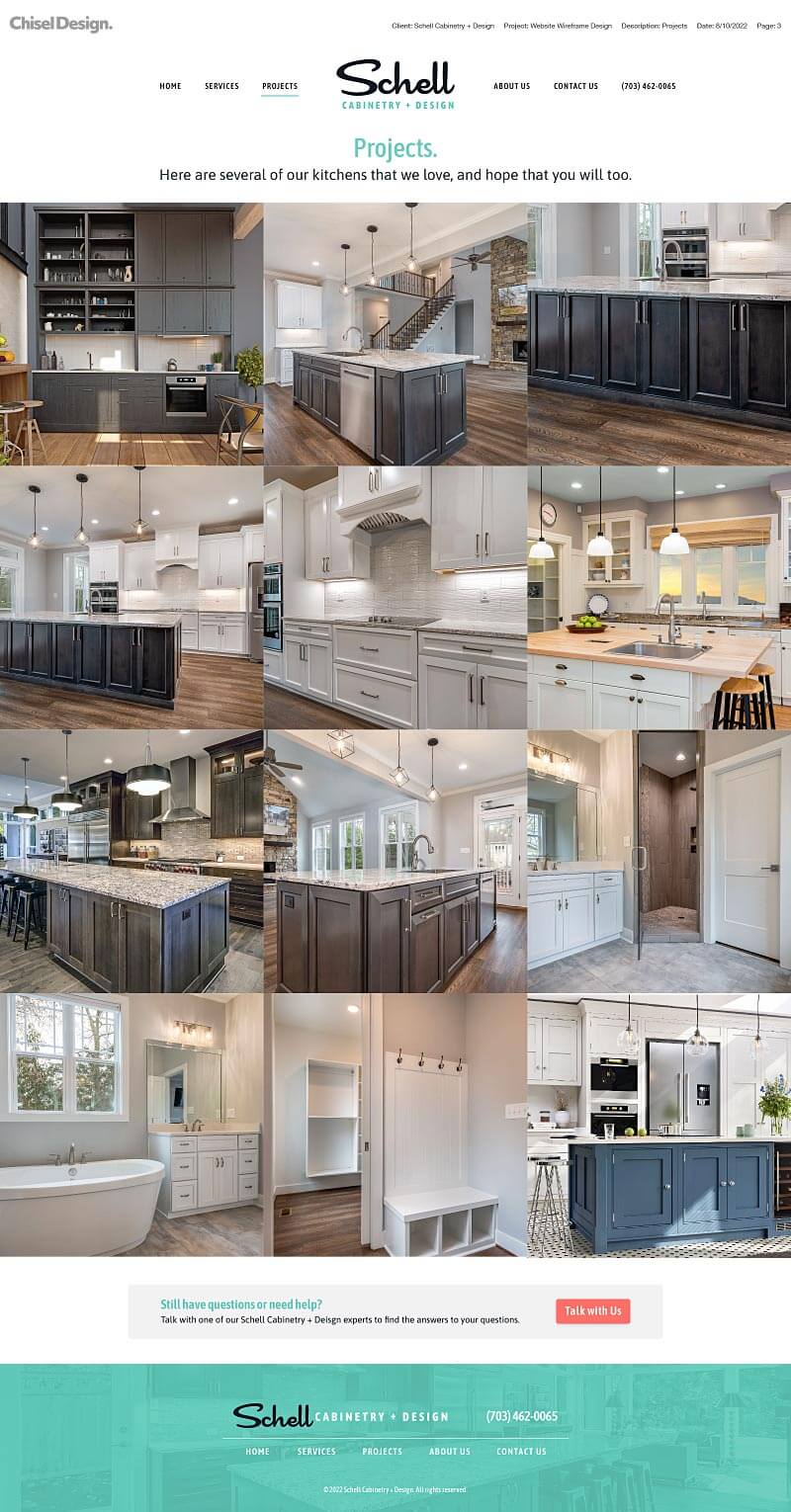
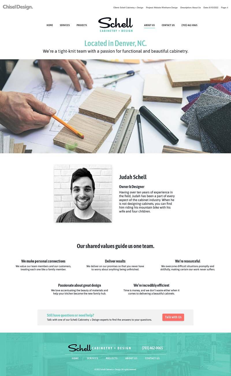
Website UX Wireframe Designs
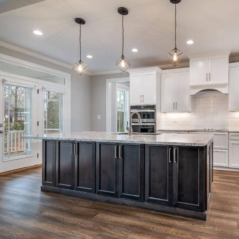
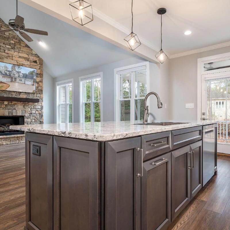
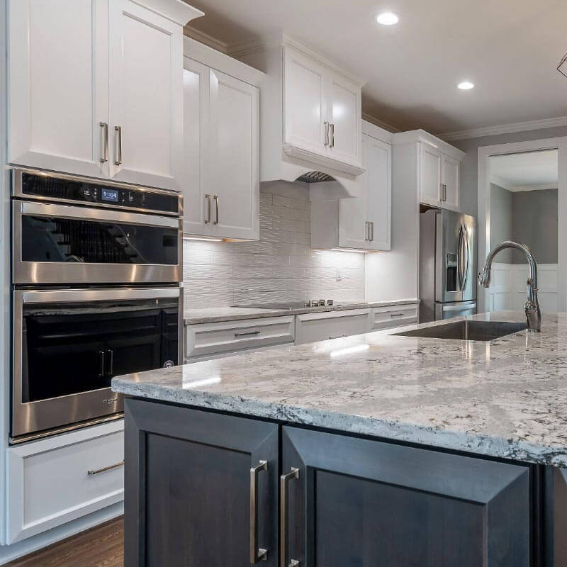
The effects that our branding, brand identity, user experience and website design has had on their business.
Schell wanted something pure, simple, and authentic; they were thrilled to see all of the work we designed for them. They said that, “the logo feels true to we are,” and the visual design of the apparel and website has helped them look like a professional company.
In our initial interview with the great team at Schell, they said that they wanted to appear as they actually are – uncomplicated, easy to interact with, and honest.
We helped them build credibility and trust with they’re customers by designing a brand identity that communicates honestly about their craftsmanship and expertise. As a result, the word-of-mouth advertising has been a tremendous boost to their efforts, not to mention they’re closing 33% of business when prospective customers contact them via phone or email.
They are absolutely crushing it!
