MicroImage Technologies.
About the Client
Micro Image Technologies is a trusted advisor to the most skilled surgeons and world-renowned hospitals throughout the Northeast, and has been since 1996. They needed to better establish their company to clearly illustrate their continued excellence and experience within the medical community. Prior to starting our engagement, Micro Image Technologies didn’t have much of a web presence and struggled to have a consistent and meaningful visual identity.
In partnership with our good friends at Dark City Digital, a digital marketing and communications agency, we worked with Micro Image to develop a brand identity and web presence consistent with the standards of their audience consisting mainly of hospital C-Suite Executives and senior hospital administrators. We began the project with the goal to build a significantly better perception as a professional services vendor to hospitals and surgical suites.
The Challenge
The challenge we faced was to continue building on their name recognition by designing a brand identity and logo design that visually anchored their business. We also worked to help in providing the sales team with professional looking materials so they could proudly stand out from competition.
The brand image needed to exude confidence regarding the technology associated with the microscopes and showcase them as the professional, reliable, consultative, and service orientated people they are. Ultimately, the visual identity and logo design system would need to resonate with their audience of hospital C-Suite Executives, Medical Doctors, Chairman of Surgeons, Biomedical Engineers, and IT/OR Directors.


Print Design
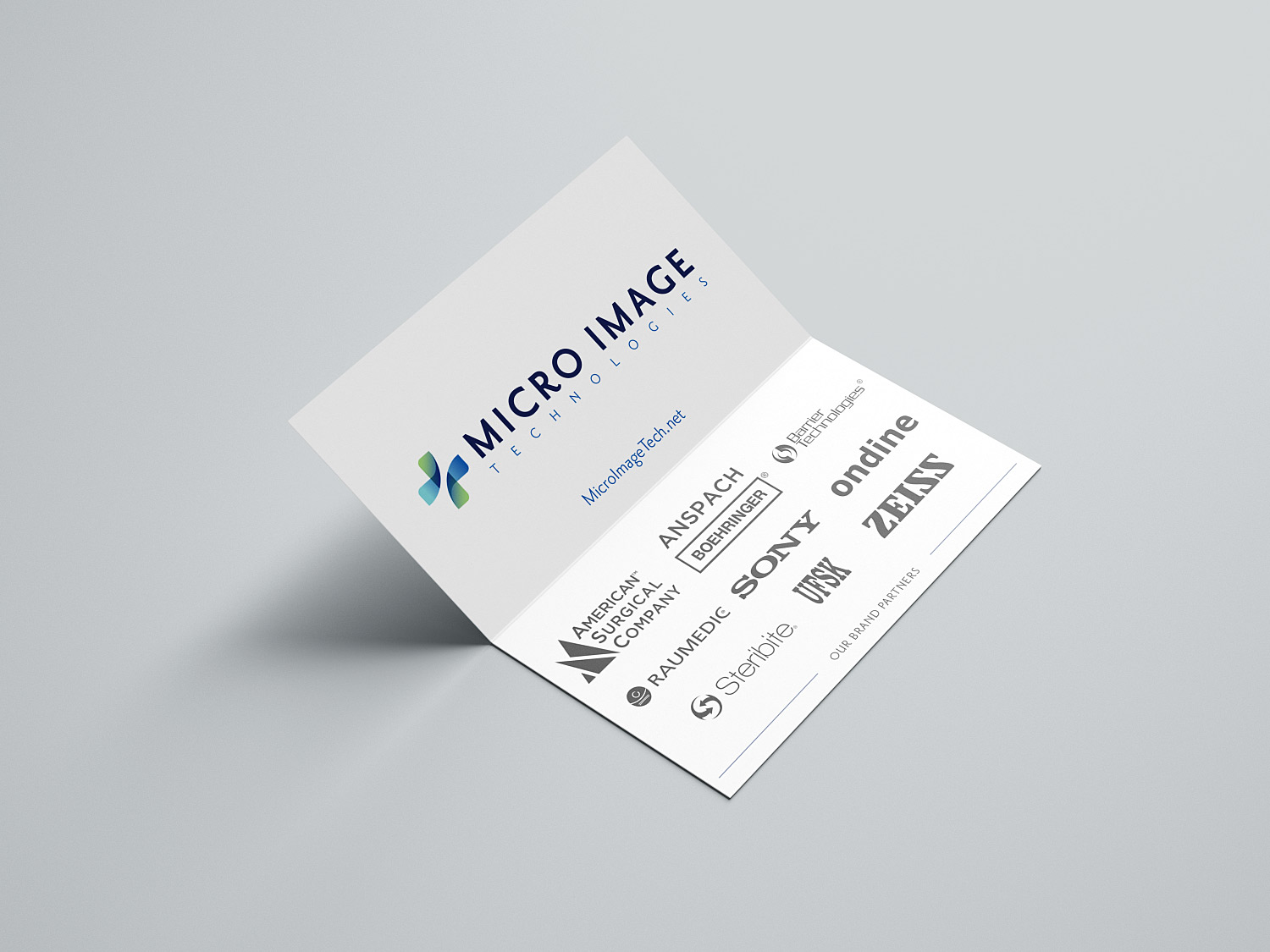
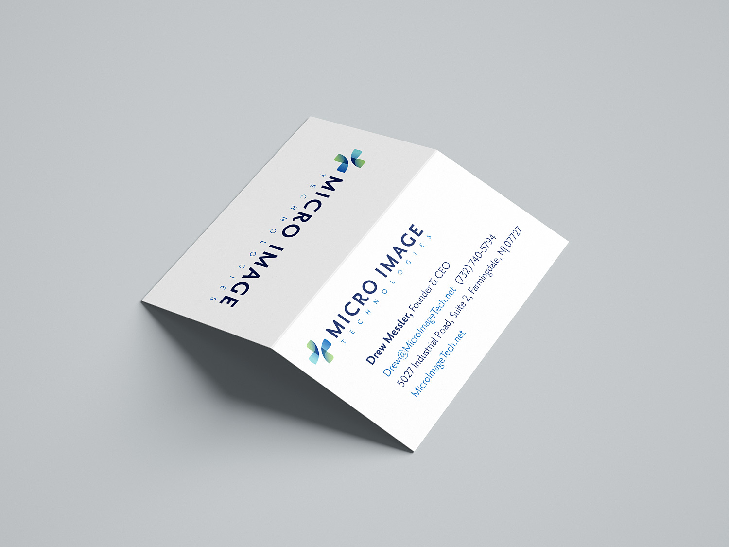
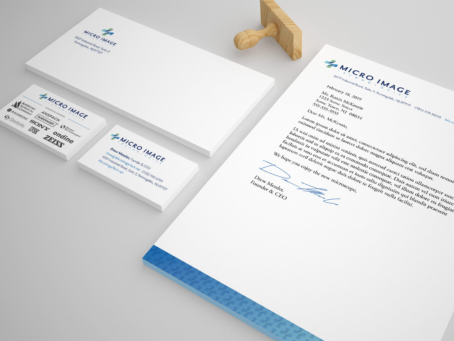
We designed the business cards to be folded so they could be used as name cards at meetings and events to easily identify themselves to senior hospital administrators and medical professionals. An elegant way to better differentiate Micro Image from their competition.
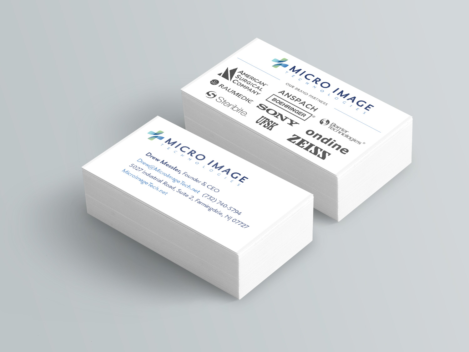
We also saved additional collateral by placing the brands they represent on the cards.
It goes without saying that we want them to be successful, even when writing letters to clients and prospective buyers. So we created both print and digital version of their letterhead.
Business Card Specs: 2 PMS colors + full-color digital, 3.5″ x 4″ and 3.5″ x 2″, Cougar Smooth 16 pt. cover, 1/2 fold, 2-sided
Letterhead Specs: 2 PMS colors + full-color digital, 8.5″ x 11″, Cougar Smooth Text 100 lb. with bleeds
IA, UX/UI and Website Design
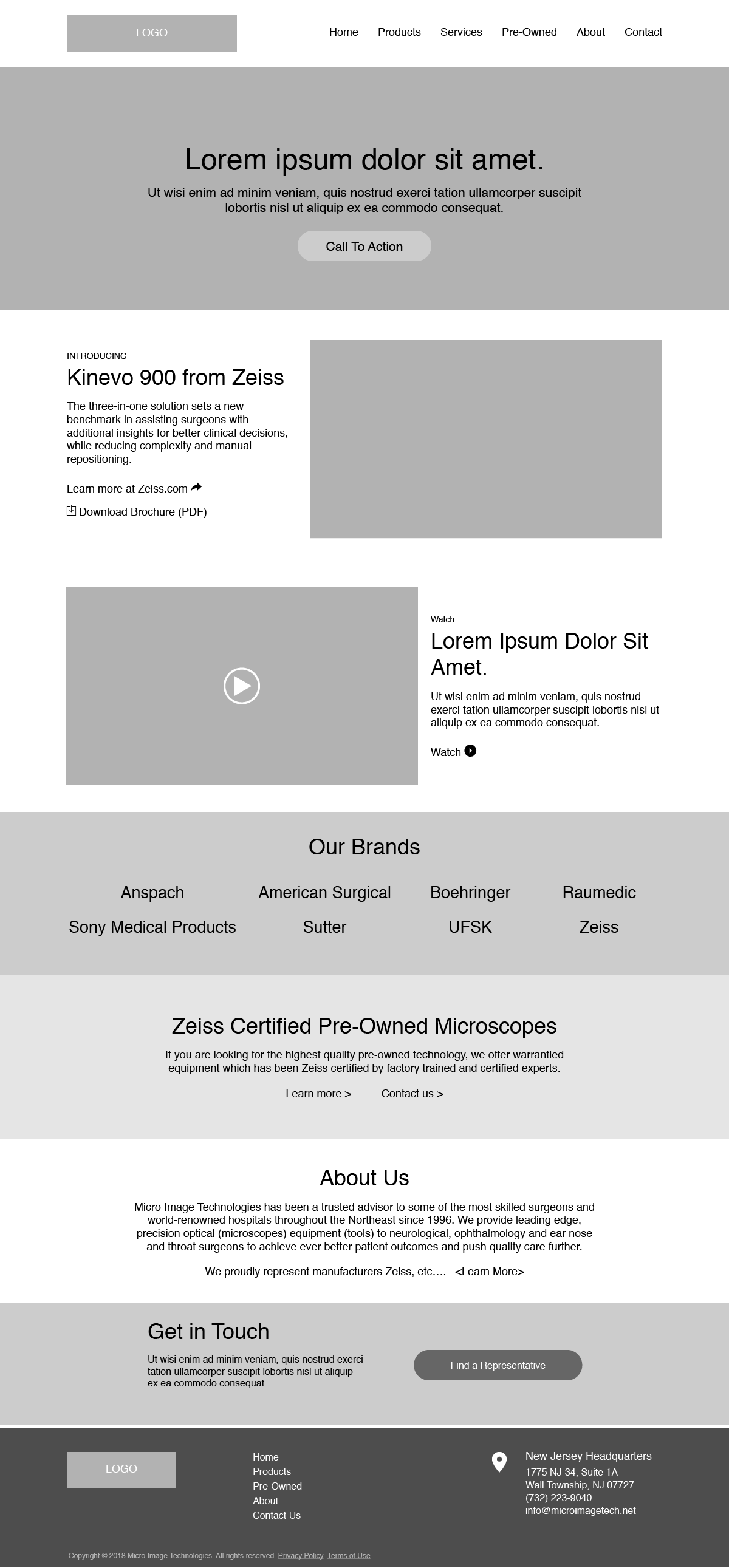
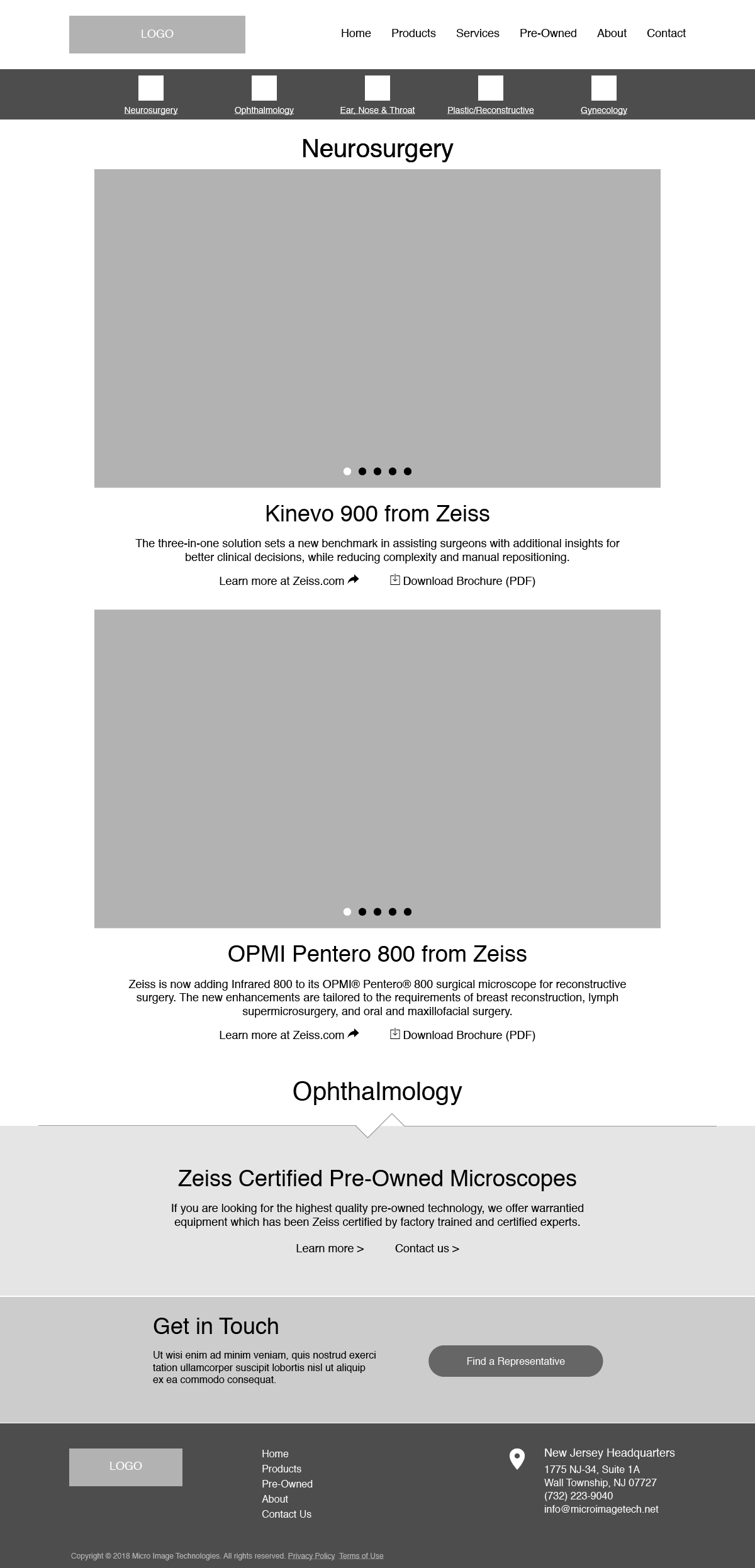
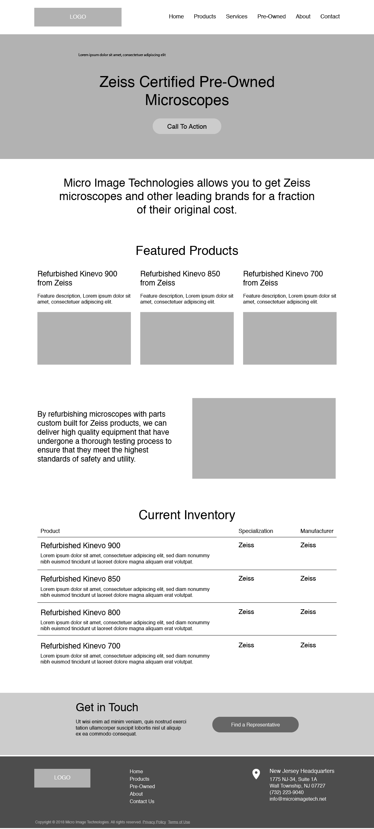
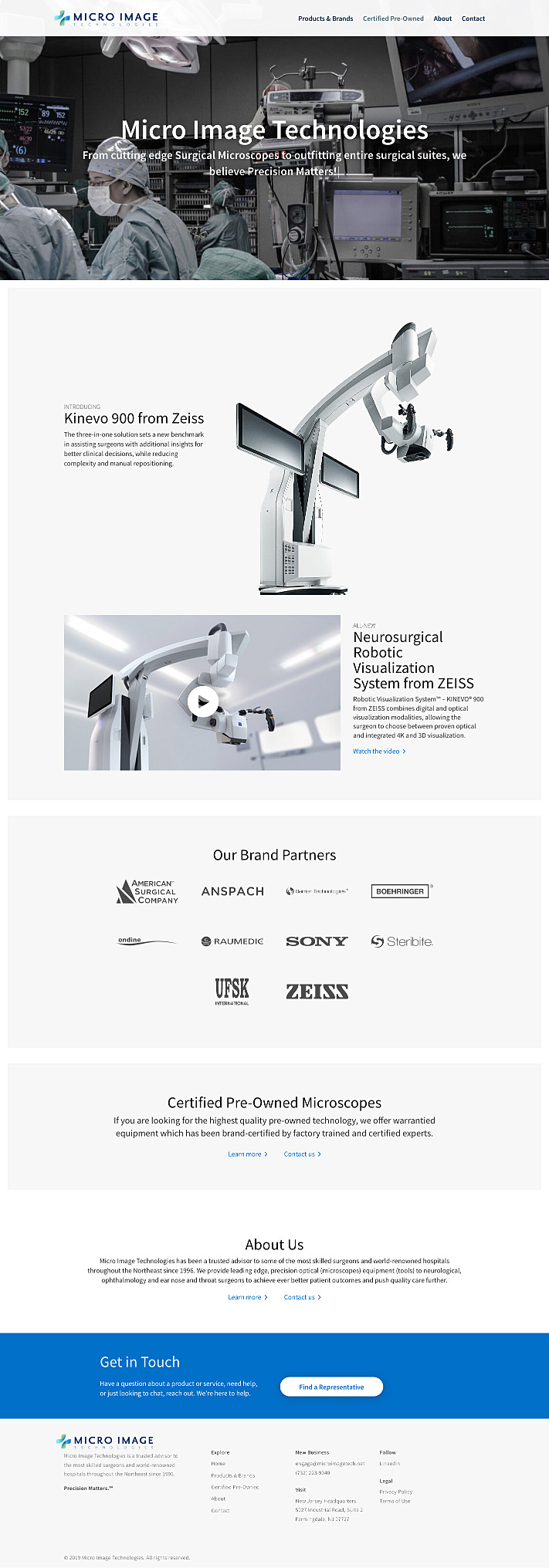
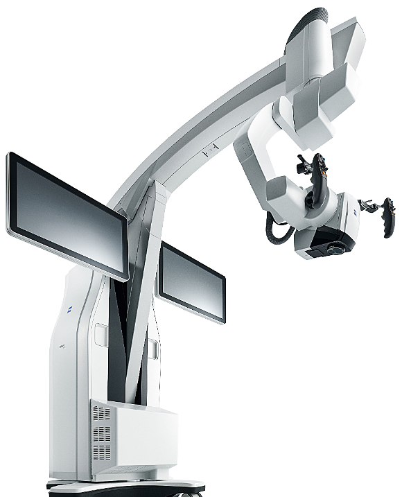
Product offerings and highlighting expertise in this space continues to be at the forefront of Micro Image’s goals. We took their most sophisticated microscope and featured it on the home page, which helping their audience quickly find the information they needed. We organized the information to be products first, then highlight brands supported. Another important aspect to their business is centered around the certified pre-owned microscope market, which became another area of importance for potential buyers.
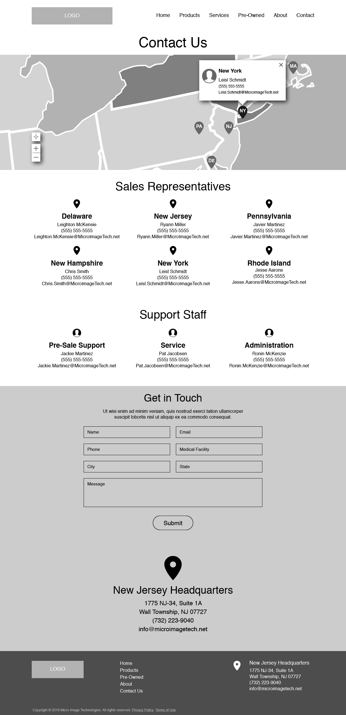
For the Contact Us page, we created an interactive regional map to better inform buyers who their representative is — simple mechanism to streamline the sales process and reduce confusion.
The entirety of the experience builds credibility, help customers find detailed information quickly, and further distinguish Micro Image as a trusted advisor to some of the most skilled surgeons and world-renowned hospitals throughout the Northeast.
Sales Enablement
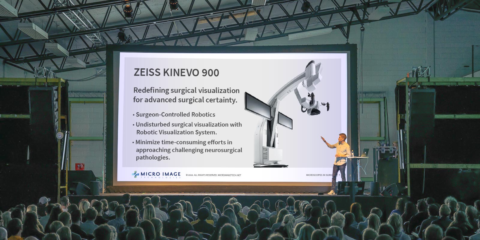
Designing a high-quality Powerpoint template became essential as we better understood the company, their sales process, and who makes up their audience.
Up to this point, the sales representatives created their own ad-hoc presentations, which led to a lot of inconsistencies and awkward presentations.
We worked with the sales team to create professional and unified presentation materials using their own product imagery. In the end, our efforts helped them present their material n a more confident and focused manner.
The effects that our branding, logo design, visual identity, and website design had on their business.
Working in collaboration with Dark City Digital who perfected the marketing and content strategy, while we formed the brand strategy and messaging. We condensed their messaging into a singular brand statement, reinforcing their promise — Precision Matters.™
The resulting set of stratagies and visual identity system speaks directly to their audience of medical professionals and confidently represents the expertise of their people and the important work they provide across medical fields.
We also helped their sales team with a professional looking sales kit to ease purchase friction and readily supplying them with product information and availability. The result: expedited orders and sales channel growth.
Micro Image has received numerous compliments about the work we did, raising both brand awareness and their expertise in the eyes of hospital executives. Our work helped them more easily interact with C-Suite Executives, Medical Doctors, Chairman of Surgeons, Biomedical Engineers, and IT/OR Directors.
On another note, our good friends at Dark City Digital have since received several referrals for both marketing and design work as a result of our efforts on this project.
