Magpie Market Antiques.
About the Client
Opened in 2022, Magpie Market Antiques is a new kind of antique store. Gone are the shelves of dark, dusty, piles from grandpa’s basement; at Magpie Market you will find delightfully displayed treasures of the past, in a bright and beautiful 3000 square foot boutique.
Opening the doors of a retail storefront, they needed a brand identity that reflected their eclectic personalities, yet felt authentic enough that it appealed to a variety of people and draw them into the store.
The Challenge
The client came to us with a couple of really good logo concepts in mind, and while they relied on us to craft them into a viable logo, they trusted us to create a logo and a brand identity that is magnetic and beautiful. Taking the obvious reference from the name, the biggest challenge we faced was how to design it so that it comes alive as a powerful and confident mark. We also needed to make sure the brand signature harkened to the past and appeared timeless.
The e-commerce strategy was a bit different for us because the client wanted us to point them in the right direction, so they could do the work presenting items and maintaining inventory.
Initial Logo Design Explorations
Final Logo Designs
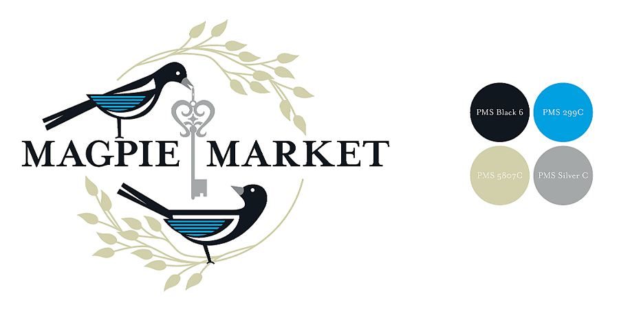
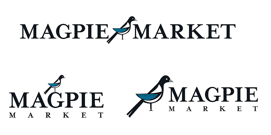
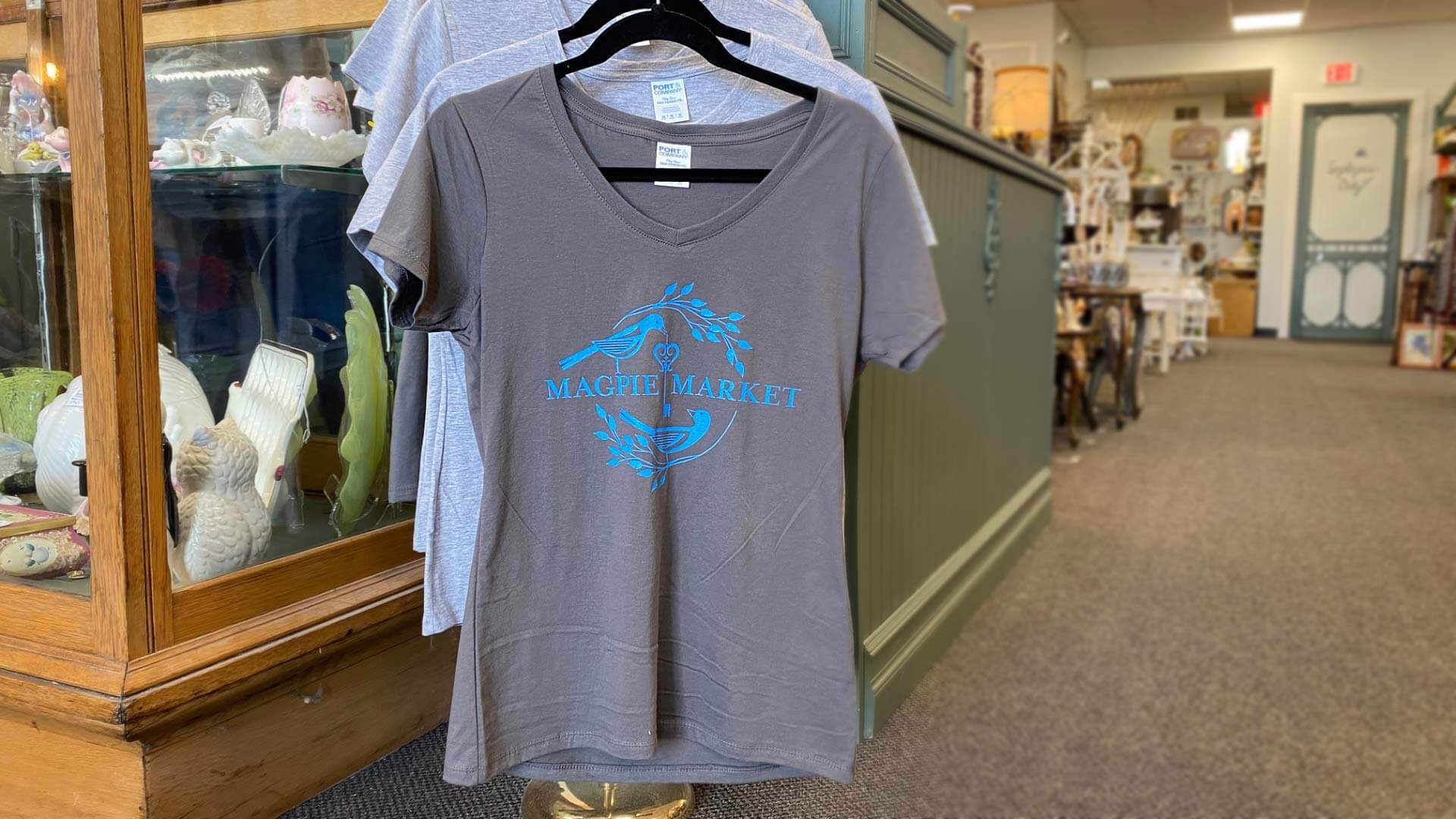
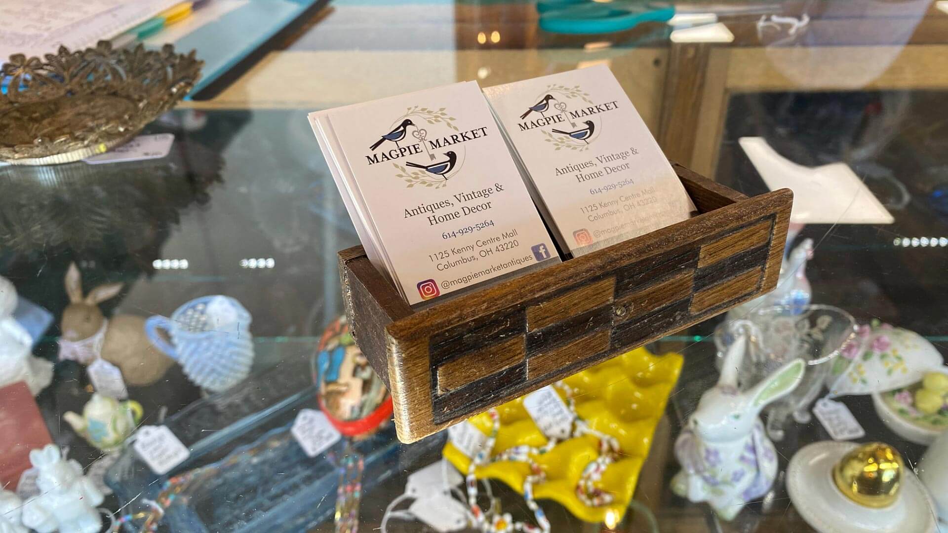
Our logo design system contains a primary brand mark that can be used anywhere, along with a series of alternate versions. This allows for tremendous consistency and flexibility for our client wherever they want to use their logo.
The color scheme that we used starts off with the extremely high contrast of the birds in black with blue highlights. We then leveraged a lightly colored green and metallic silver to both soften the design so that it would feel visually balanced.

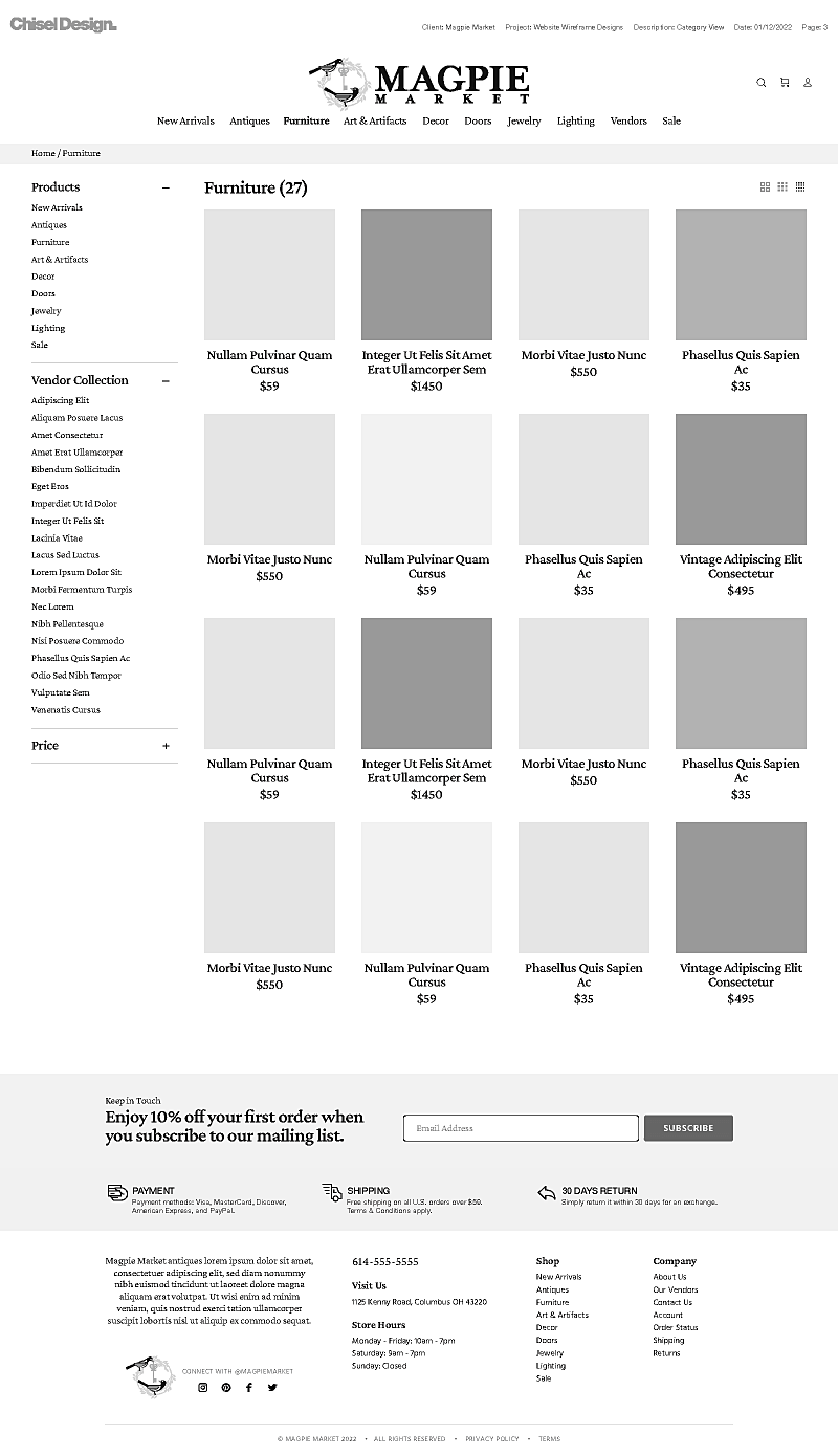
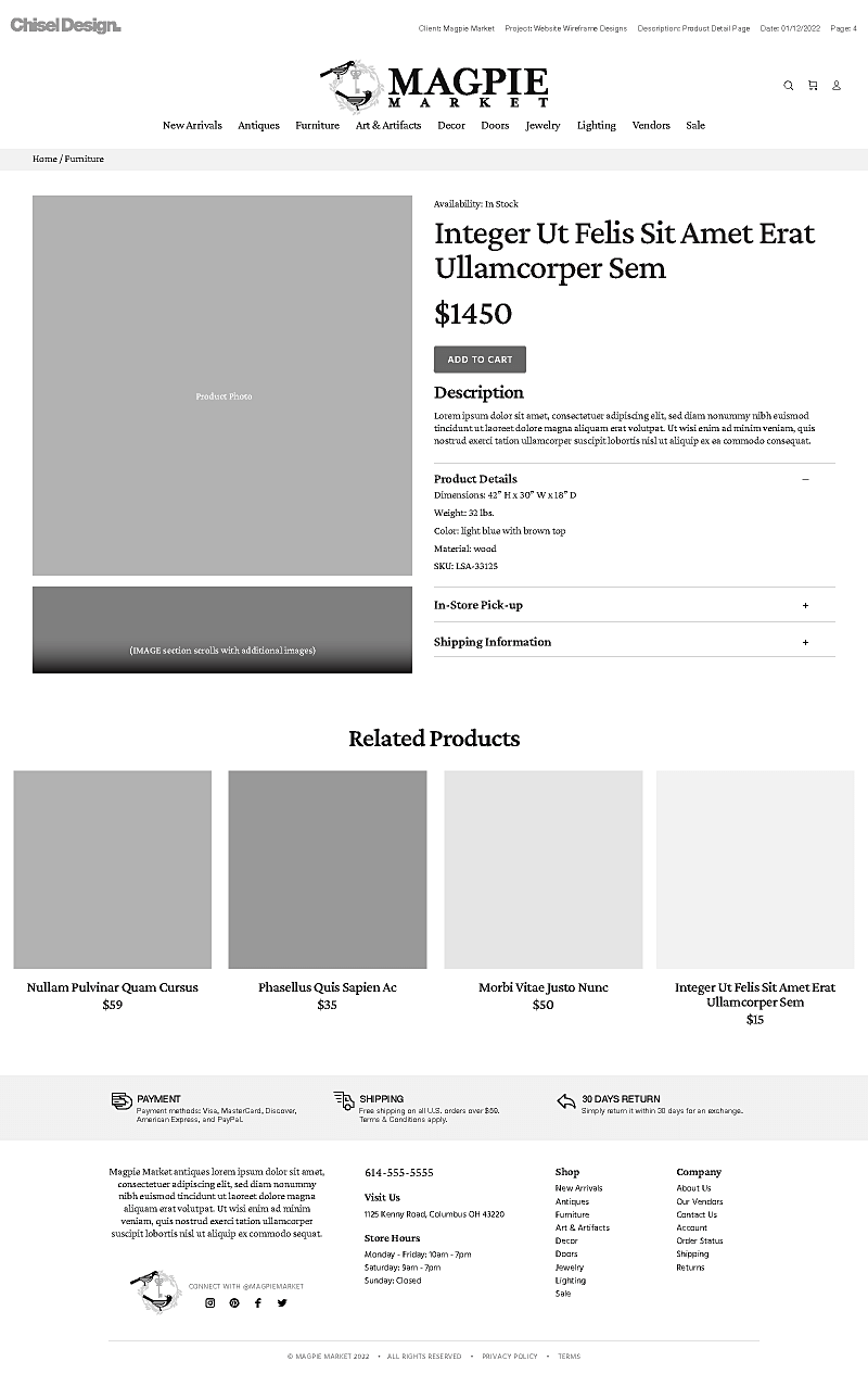
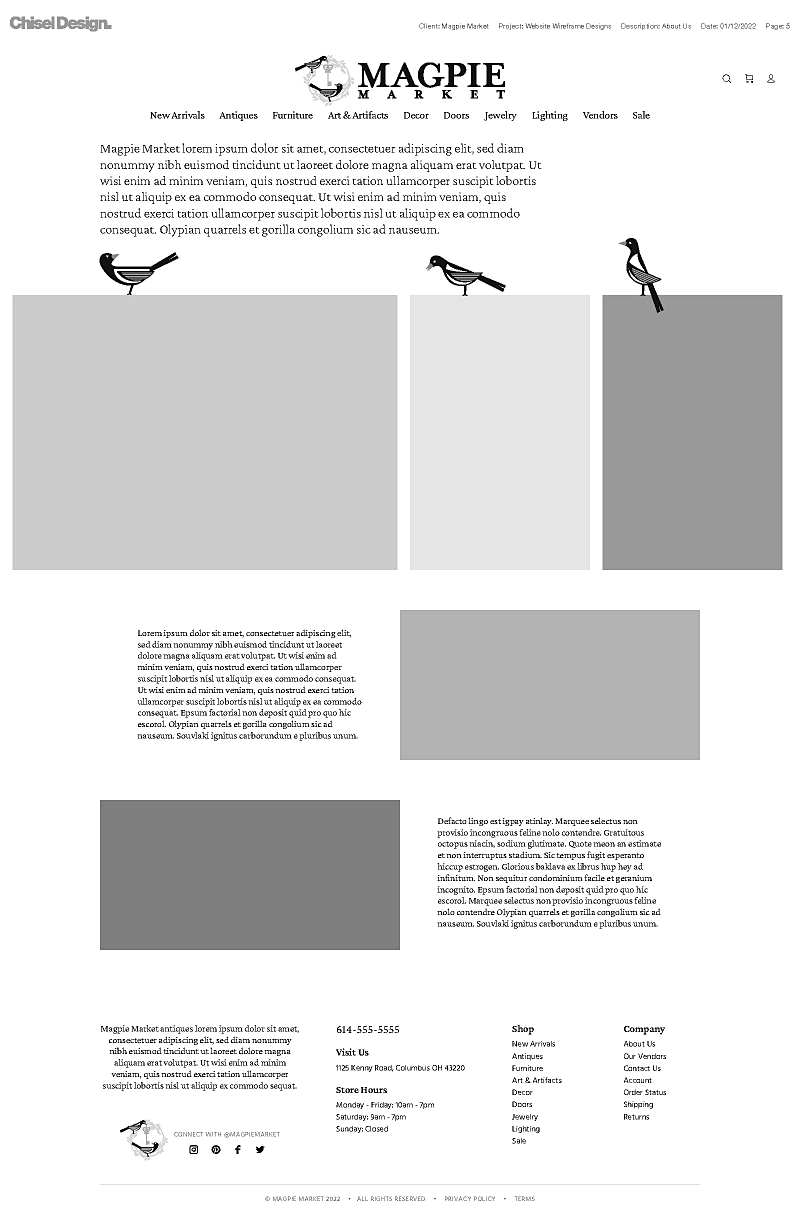
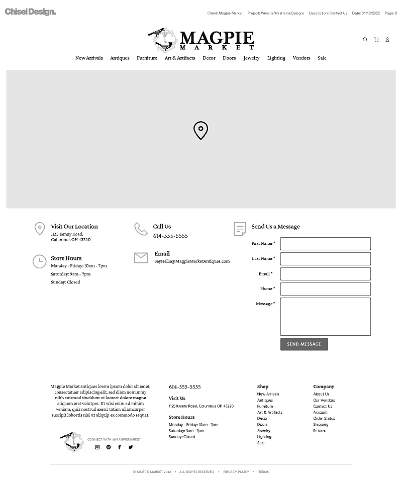
Website UX Shopping Wireframe Designs
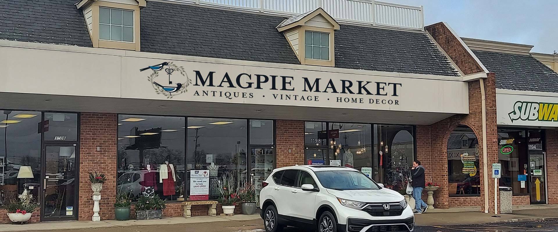
The effects that our branding, logo design, visual identity, and user experience design has had on their business.
We started this project with a hand-drawn concept from one of the owners of Magpie Market Antiques, and created several other fantastic designs based on their market space using a combination of symbolism, imagery, and typography. As we continued to refine the brand mark, we transformed it into something that is unmistakably their own.
The symbolism of the two magpies represents the two owners of the business. The key is stylized so that the bow (top portion) is fashioned to resemble a heart depicting the work they both love. Both birds are looking at each other to make sure the quality of items meet their brand standards. The ringed nest represents the warm relationship they hope to have with in-store vendors and patrons alike.
We also crafted an e-commerce strategy that they could implement, build, and maintain themselves. The goal was setting our client up for long-term success in a way they could easily manage the work. We all agreed that starting with Facebook Marketplace and branching out to Shopify was the most cost-effective way to go.
All together, we helped them look like a professional retailer in a space dominated by a patchwork of confusing and jumbled antiques shops. We provided clarity to their namespace, helped elevate credibility, build brand recognition, and given them a great foundation for brand loyalty.

